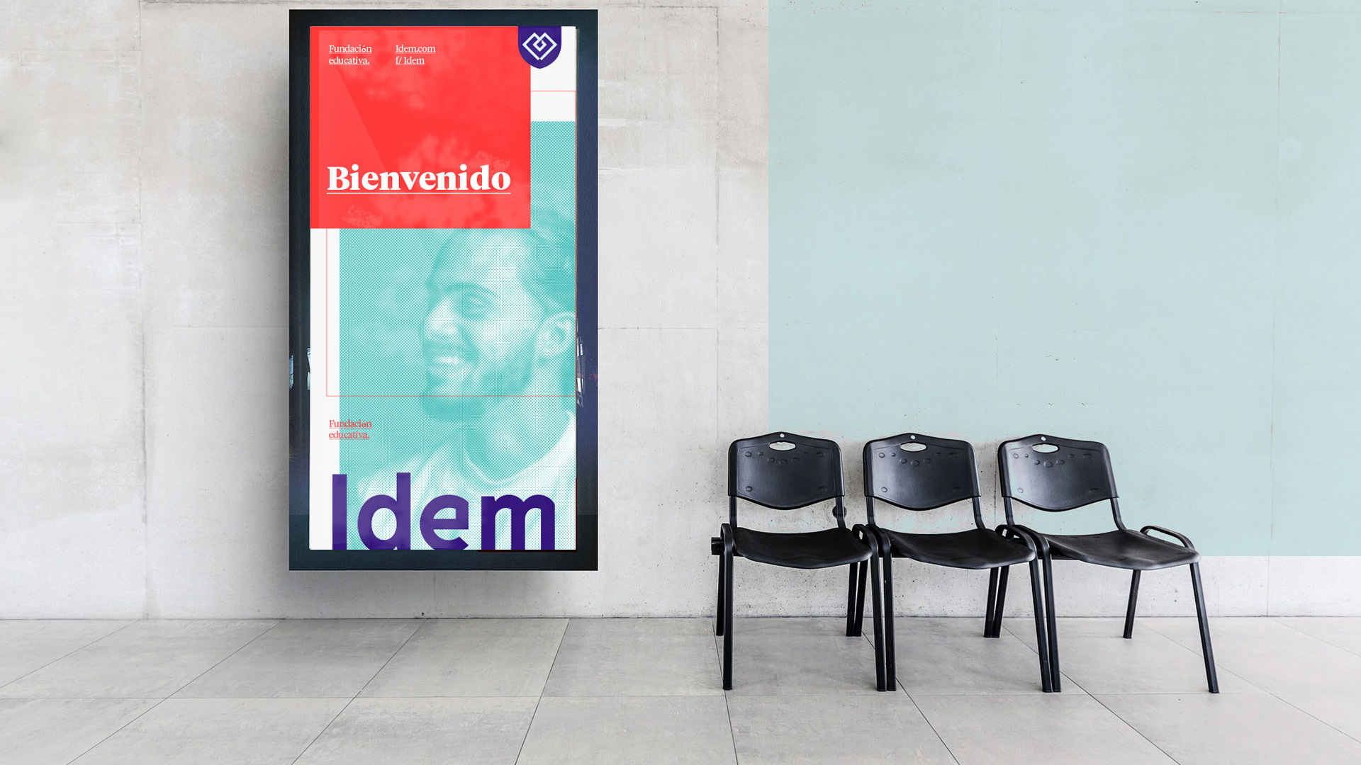
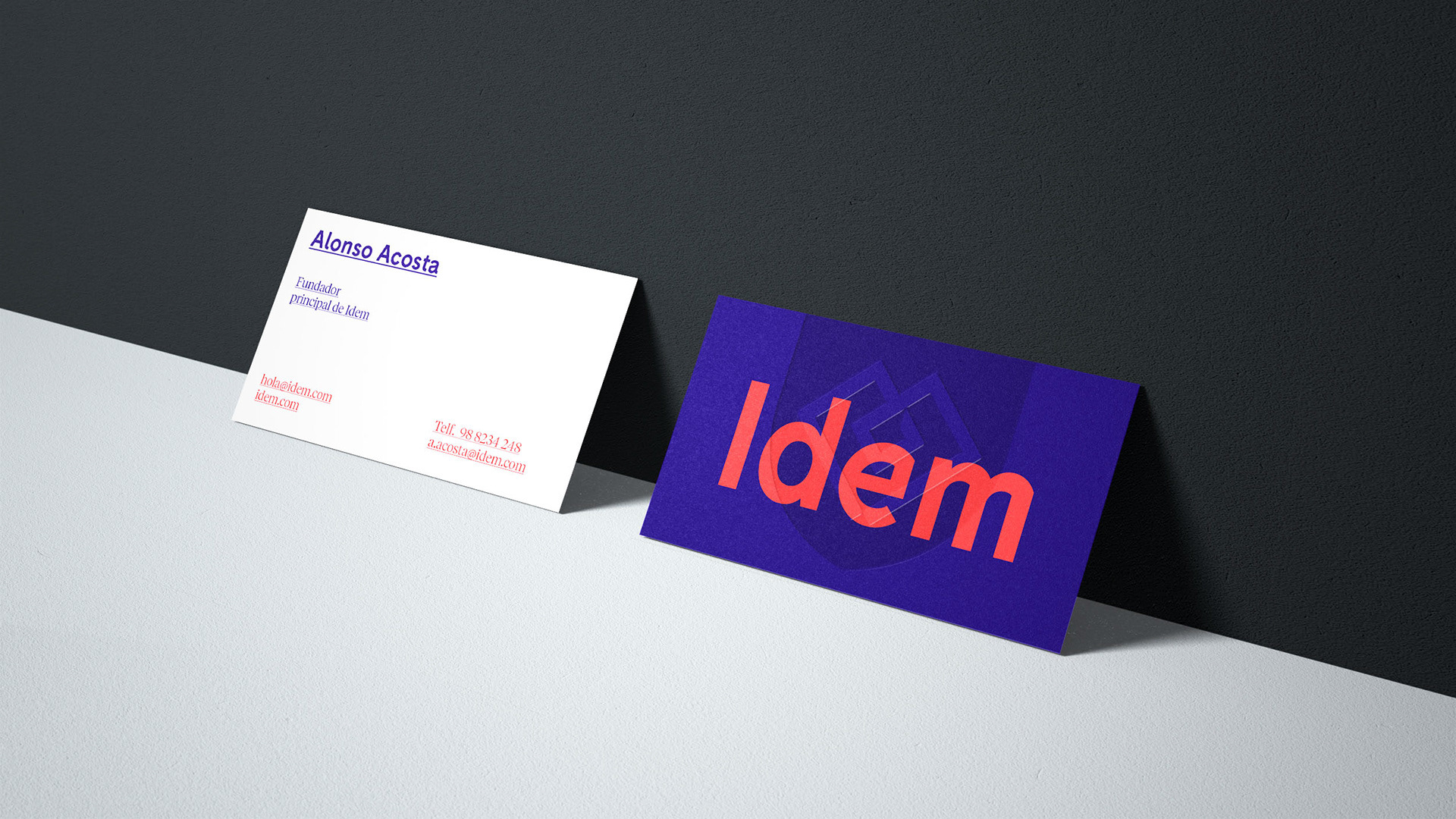
I Freelance Project 2019 I
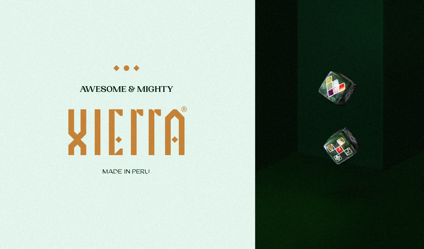
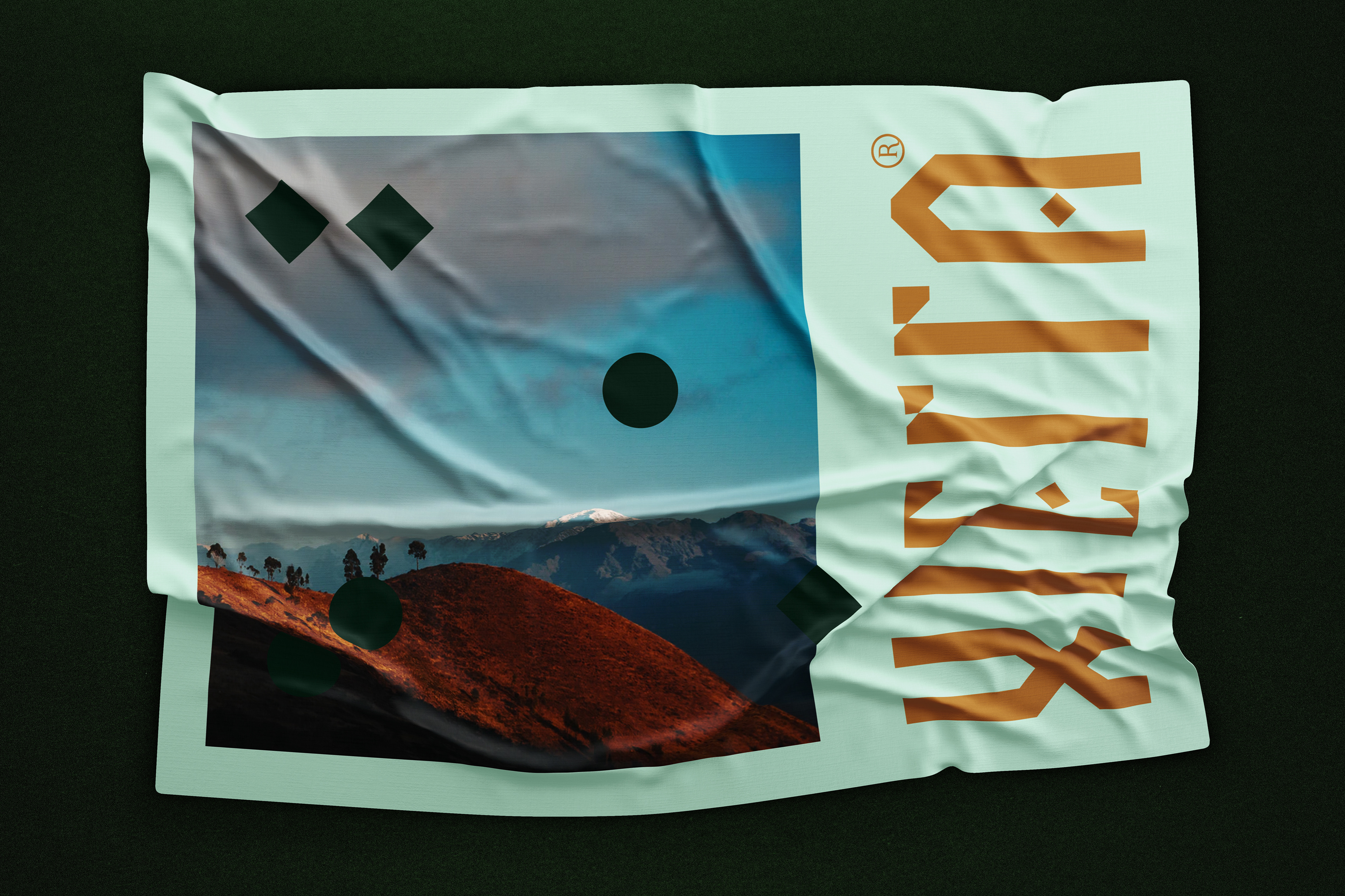
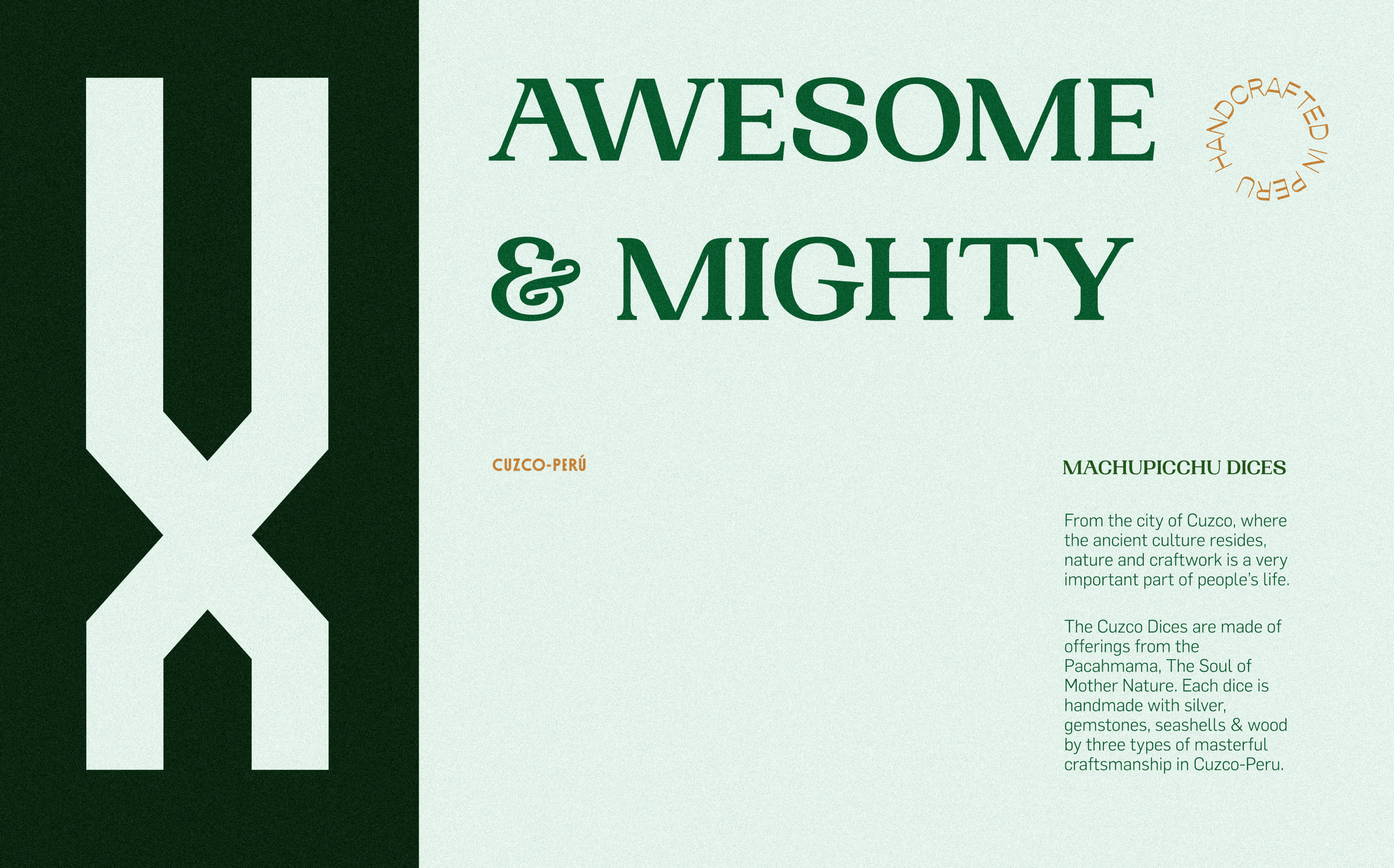
With A lettering designed exclusively for the brand using the rough and geometric finishes as a link to the carving, the XIERRA logo has a powerful, legible and authentic Wordmark WICH PERFECTLY REFLECTS THE PERUVIAN AND ANCIENT ORIGIN OF THE BRAND.
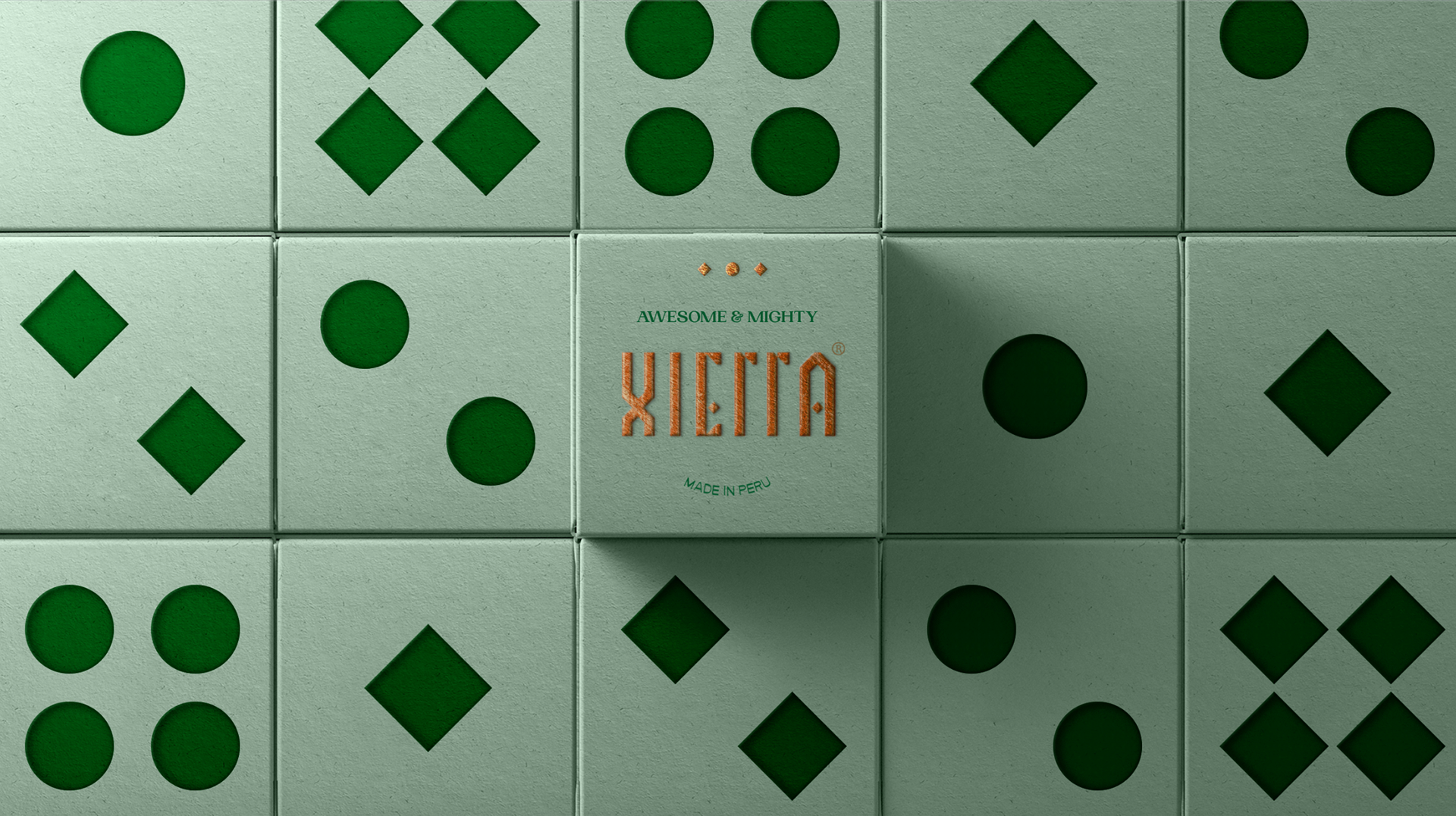
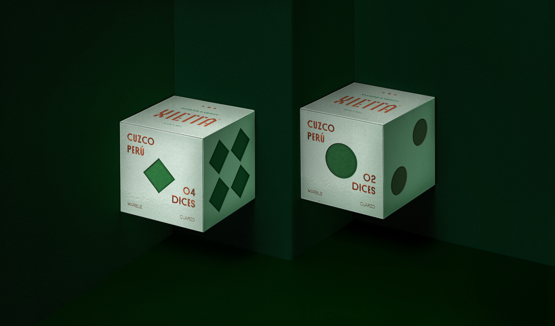
as the main product was the Cusco dices, its iconic shape was used as the protagonist for the packaging reflecting the product on the box as itself.
Taking into account the differential value of the brand, it was decided to use the PP Woodland typeface with pen strokes and calligraphy, thus showing the “handcrafted” side of the product and Opposit FT as a support typeface enfatizing the forms of architecture native to Cuzco and the geometric shapes of the dices. We also appropriated the iconic green color of the dice material to align the concept of the natural, thus generating an elegant and attractive color palette.